
Another official Australian report has been doctored to gloss over rising inequality
- Written by: Peter Saunders, Research Professor in Social Policy, UNSW
First it was the Bureau of Statistics. It produced an notoriously bland press release headed “Inequality stable since 2013-14[1]” when its own analysts had told it there had been a “significant increase” in wealth inequality since 2011–12, that wealth inequality was “at its peak” since it was first measured, and that there had been “a significant downward change” in the wealth share of the bottom fifth of Australian households.
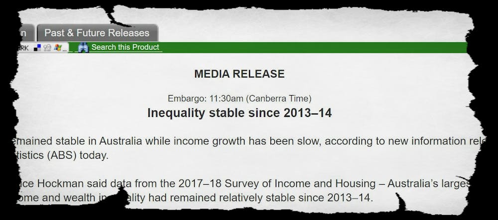 The analyst who penned the note about the significant downward change added, in what appears to have been a plea for guidance: “I’m not sure that we want to draw attention to this though??[2]”.
 We know this only because of emails released by the Bureau of Statistics in response to a Freedom of Information request.
Christopher Sheil and Frank Stilwell drew attention to it in The Conversation[3] and then went on to suggest that the Productivity Commission might have also been downplaying[4] the growth in wealth inequality by producing its own bespoke measure at odds with others.
Read more:
It's not just the ABS. It's also the Productivity Commission downplaying the growth in inequality[5]
I am not convinced that the Productivity Commission did downplay the growth in wealth inequality, but that doesn’t mean sensitivity about inequality isn’t widespread in official circles, apparently including, as I will outline, the Australian Institute of Health and Welfare[6].
First, the Productivity Commission.
Sheil and Stilwell present a chart showing the Commission’s 2017 report[7] to be “the odd man out” among five studies – the only one to show a decline in the share of wealth going to the top 10% between 2013-14 and 2015-16.
Productivity Commission understandable
But on the graph presented by the Productivity Commission itself the decline is miniscule.
The PC study also measured a different thing to the other studies: so-called equivalised wealth, which is wealth adjusted for household size and composition.
This isn’t the place to argue the merits of the PC approach (I have problems with it), merely to note that if the PC’s findings were substantially different from other findings, it might be because it was measuring something different.
Read more:
Inequality is growing, but it is also changing as Australia's super rich evolve[8]
This isn’t the case for what happened two years ago at the government-funded Australian Institute for Health and Welfare.
Institute for Health and Welfare inexplicable
We know this only because of emails released by the Bureau of Statistics in response to a Freedom of Information request.
Christopher Sheil and Frank Stilwell drew attention to it in The Conversation[3] and then went on to suggest that the Productivity Commission might have also been downplaying[4] the growth in wealth inequality by producing its own bespoke measure at odds with others.
Read more:
It's not just the ABS. It's also the Productivity Commission downplaying the growth in inequality[5]
I am not convinced that the Productivity Commission did downplay the growth in wealth inequality, but that doesn’t mean sensitivity about inequality isn’t widespread in official circles, apparently including, as I will outline, the Australian Institute of Health and Welfare[6].
First, the Productivity Commission.
Sheil and Stilwell present a chart showing the Commission’s 2017 report[7] to be “the odd man out” among five studies – the only one to show a decline in the share of wealth going to the top 10% between 2013-14 and 2015-16.
Productivity Commission understandable
But on the graph presented by the Productivity Commission itself the decline is miniscule.
The PC study also measured a different thing to the other studies: so-called equivalised wealth, which is wealth adjusted for household size and composition.
This isn’t the place to argue the merits of the PC approach (I have problems with it), merely to note that if the PC’s findings were substantially different from other findings, it might be because it was measuring something different.
Read more:
Inequality is growing, but it is also changing as Australia's super rich evolve[8]
This isn’t the case for what happened two years ago at the government-funded Australian Institute for Health and Welfare.
Institute for Health and Welfare inexplicable
 Australian Institute of Health and Welfare[9]
Every two years since 1993 the AIHW has produced a report that presents reliable and detailed information about the need for and provision of welfare services such as aged care, child care, education, housing and disability services.
Every two years since 1993 the Australian Institute for Health and Welfare (AIHW) has produced a report that presents reliable and detailed information about the need for and provision of welfare services such as aged care, child care, education, housing and disability services.
I was involved in early discussions about the structure and content of Australia’s Welfare[10] and have been asked (with others) to comment on draft chapters prior to release. In 1999 I contributed a chapter. I spoke at its launches in 1997 and 2005. I am a strong supporter of the AIHW and of its work.
In recent years it has added an overview of Australia’s welfare progress over a wide range of dimensions using a framework that covers 15 key indicators divided into seven themes.
It summarises recent changes in each indicator and indicates whether they are, on balance, favourable or unfavourable, or whether there has been no change or no clear trend.
Australian Institute of Health and Welfare[9]
Every two years since 1993 the AIHW has produced a report that presents reliable and detailed information about the need for and provision of welfare services such as aged care, child care, education, housing and disability services.
Every two years since 1993 the Australian Institute for Health and Welfare (AIHW) has produced a report that presents reliable and detailed information about the need for and provision of welfare services such as aged care, child care, education, housing and disability services.
I was involved in early discussions about the structure and content of Australia’s Welfare[10] and have been asked (with others) to comment on draft chapters prior to release. In 1999 I contributed a chapter. I spoke at its launches in 1997 and 2005. I am a strong supporter of the AIHW and of its work.
In recent years it has added an overview of Australia’s welfare progress over a wide range of dimensions using a framework that covers 15 key indicators divided into seven themes.
It summarises recent changes in each indicator and indicates whether they are, on balance, favourable or unfavourable, or whether there has been no change or no clear trend.
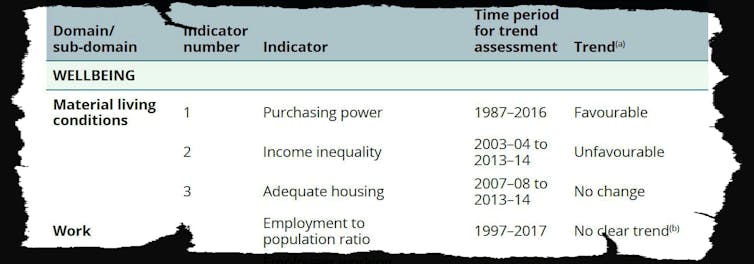 Australia's Welfare 2017, table 9.2.2[11]
One of the themes is material living conditions. The second of its three indicators is income inequality.
Australia's Welfare 2017, table 9.2.2[11]
One of the themes is material living conditions. The second of its three indicators is income inequality.
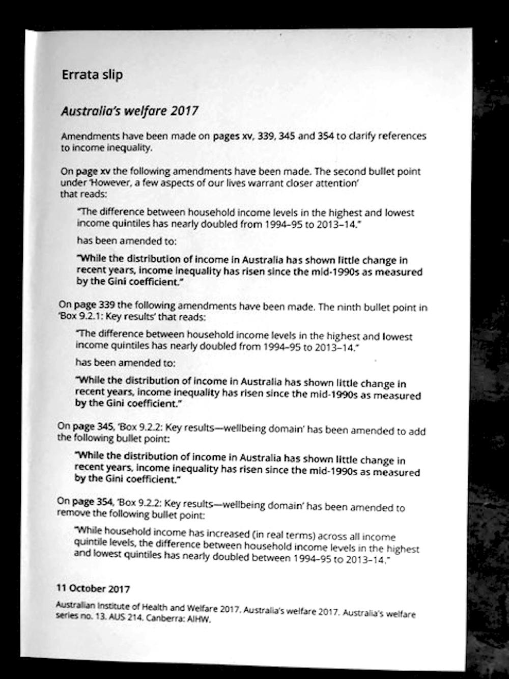 "Errata Slip", AIHW
Table 9.2.2 summarises the changes between 2003-04 and 2013-14 as “unfavourable”.
Yet when I received my hard copy of that report in mid-November 2017, I was surprised to find a loose-leaf insert inside the front cover headed “Errata slip,” dated October 11, 2017.
An errata is usually a list of factual errors and corrections.
This one dealt not with factual errors but contained what were essentially three changes to the way in which income inequality was described, all of them the same.
In each case a phrase like this was removed
The difference between household income levels in the highest and lowest income quintiles has nearly doubled from 1994-95 to 2013-14
and replaced by one like this
While the distribution of income in Australia has shown little change in recent years, income inequality has risen since the mid-1990s as measured by the Gini coefficient.
Each quintile contains one-fifth of the population, where the top quintile contains those with the highest incomes and the bottom contains those with the lowest incomes.
The statement that has been replaced is correct. The difference between household income levels in the highest and lowest income quintiles had nearly doubled between 1994-95 and 2013-14.
But it has been expunged from the version of the report that can be downloaded from the AIHW website, even though careful readers will note that one instance of it still survives unexpurgated on page 355.
"Errata Slip", AIHW
Table 9.2.2 summarises the changes between 2003-04 and 2013-14 as “unfavourable”.
Yet when I received my hard copy of that report in mid-November 2017, I was surprised to find a loose-leaf insert inside the front cover headed “Errata slip,” dated October 11, 2017.
An errata is usually a list of factual errors and corrections.
This one dealt not with factual errors but contained what were essentially three changes to the way in which income inequality was described, all of them the same.
In each case a phrase like this was removed
The difference between household income levels in the highest and lowest income quintiles has nearly doubled from 1994-95 to 2013-14
and replaced by one like this
While the distribution of income in Australia has shown little change in recent years, income inequality has risen since the mid-1990s as measured by the Gini coefficient.
Each quintile contains one-fifth of the population, where the top quintile contains those with the highest incomes and the bottom contains those with the lowest incomes.
The statement that has been replaced is correct. The difference between household income levels in the highest and lowest income quintiles had nearly doubled between 1994-95 and 2013-14.
But it has been expunged from the version of the report that can be downloaded from the AIHW website, even though careful readers will note that one instance of it still survives unexpurgated on page 355.
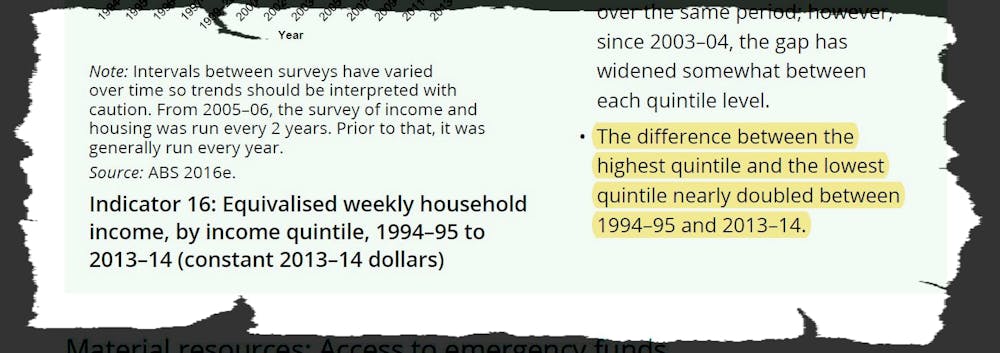 The one that got away, marked in yellow.
Australia's Welfare 2017, page 355[12]
The changes struck me as weird at the time.
Errata are normally reserved for correcting or removing gross errors of fact discovered after printing. In this case, the changes simply replaced a factually correct statement of what the data showed (that income inequality had gone up substantially) with one that was far more qualified.
I find it inconceivable that those responsible for producing such a well-researched, meticulously-checked, authoritative and extensively assessed (internally and externally) report would, at this very late stage, have decided to insist on the change themselves.
Read more:
Don't believe what they say about inequality. Some of us are worse off[13]
So did the Institute give in to external pressure to conform and fall in behind the (incorrect) government line that income inequality hasn’t grown? It’s hard to think of another explanation.
If this is the case, what the Institute did is made it easier for the Bureau of Statistics to dilute the message of its own statistics two years later.
Even stranger still…
One of the most bizarre aspects of this whole episode is that the current government has been actively pursuing policies designed to increase inequality – at least in the short-run – through substantial tax cuts[14] for those at the top, and resistance to raising Newstart[15] for those at the bottom.
Both have been justified on the grounds that widening income gaps will increase incentives to work and save and encourage more Australians to “have a go”.
It thus seems odd for the government to try to suppress or alter information that shows two of its policies working as planned, if that’s what’s happened here.
Read more:
There's a reason you're feeling no better off than 10 years ago. Here's what HILDA says about well-being[16]
We need reliable and accurate data on inequality in order to monitor all aspects of our progress and tell whether programs are working as intended. Massaging presentations to make it look as if less is happening than actually is doesn’t serve public policy well.
The agencies that provide this data must abide by the strongest possible standards to ensure the integrity of their data. As far as is known, they do. But those standards have to extend to the presentation of their data. Without that, we will become less than we are, and we will have less idea of what we are doing.
The one that got away, marked in yellow.
Australia's Welfare 2017, page 355[12]
The changes struck me as weird at the time.
Errata are normally reserved for correcting or removing gross errors of fact discovered after printing. In this case, the changes simply replaced a factually correct statement of what the data showed (that income inequality had gone up substantially) with one that was far more qualified.
I find it inconceivable that those responsible for producing such a well-researched, meticulously-checked, authoritative and extensively assessed (internally and externally) report would, at this very late stage, have decided to insist on the change themselves.
Read more:
Don't believe what they say about inequality. Some of us are worse off[13]
So did the Institute give in to external pressure to conform and fall in behind the (incorrect) government line that income inequality hasn’t grown? It’s hard to think of another explanation.
If this is the case, what the Institute did is made it easier for the Bureau of Statistics to dilute the message of its own statistics two years later.
Even stranger still…
One of the most bizarre aspects of this whole episode is that the current government has been actively pursuing policies designed to increase inequality – at least in the short-run – through substantial tax cuts[14] for those at the top, and resistance to raising Newstart[15] for those at the bottom.
Both have been justified on the grounds that widening income gaps will increase incentives to work and save and encourage more Australians to “have a go”.
It thus seems odd for the government to try to suppress or alter information that shows two of its policies working as planned, if that’s what’s happened here.
Read more:
There's a reason you're feeling no better off than 10 years ago. Here's what HILDA says about well-being[16]
We need reliable and accurate data on inequality in order to monitor all aspects of our progress and tell whether programs are working as intended. Massaging presentations to make it look as if less is happening than actually is doesn’t serve public policy well.
The agencies that provide this data must abide by the strongest possible standards to ensure the integrity of their data. As far as is known, they do. But those standards have to extend to the presentation of their data. Without that, we will become less than we are, and we will have less idea of what we are doing.
References
- ^ Inequality stable since 2013-14 (www.abs.gov.au)
- ^ I’m not sure that we want to draw attention to this though?? (www.abs.gov.au)
- ^ The Conversation (theconversation.com)
- ^ also been downplaying (theconversation.com)
- ^ It's not just the ABS. It's also the Productivity Commission downplaying the growth in inequality (theconversation.com)
- ^ Australian Institute of Health and Welfare (www.aihw.gov.au)
- ^ 2017 report (www.pc.gov.au)
- ^ Inequality is growing, but it is also changing as Australia's super rich evolve (theconversation.com)
- ^ Australian Institute of Health and Welfare (www.abs.gov.au)
- ^ Australia’s Welfare (www.aihw.gov.au)
- ^ Australia's Welfare 2017, table 9.2.2 (www.aihw.gov.au)
- ^ Australia's Welfare 2017, page 355 (www.aihw.gov.au)
- ^ Don't believe what they say about inequality. Some of us are worse off (theconversation.com)
- ^ substantial tax cuts (www.theguardian.com)
- ^ resistance to raising Newstart (thenewdaily.com.au)
- ^ There's a reason you're feeling no better off than 10 years ago. Here's what HILDA says about well-being (theconversation.com)
Authors: Peter Saunders, Research Professor in Social Policy, UNSW